Wednesday, 6 August 2014

The Prisoner, An AMC Digital Graphic Novel (Usman Rashid)

In this blog post, I will be discussing an online digital graphic novel called The Prisoner, and what I thought about this graphic novel after reading it myself, as well as how this comic can broaden an individual awareness. Palm Pre, with AMC TV supporting this digital graphic novel on their show, created this graphic novel and to see this graphic novel, visit: http://www.amctv.com/the-prisoner-graphic-novel/
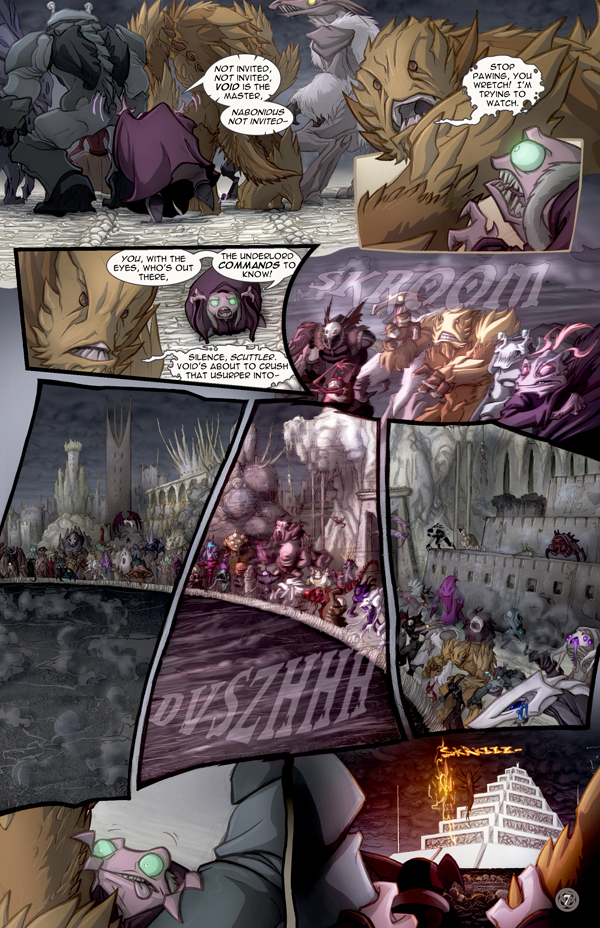
 Summary. This graphic novel talks about Rebecca Meadows, who is searching for her missing sister and her investigation leads her to The Village-- a shared experience in the unconscious minds of the people living there, developed by scientists who work for a corporation called Summakor, in order to treat patients with severe psychological illnesses. (AMC-The Prisoner Online).
            Opinion. After reading this graphic novel, I think that the digital artists who made this graphic novel as a digital comic, helped broaden both the visual and literary styles as well as the way graphic novels can be written. Graphic novels, in my opinion, help when building literary awareness to further better our comprehension of the English language, and to better understand what other kinds of literary styles are being implemented by other authors.
            Literary and Visual Devices. Some of the literary and visual devices that were being used were that, in terms of the artwork, the images were shown as clear and bold on the color and the way the characters were designed, to show what kind of mood the graphic novel is showing. Some of the key transitions that are listed in Scott McCloud’s, Understanding Comics, transitions between the panels of each image, is mostly moment-to-moment and scene-to-scene, in which different backgrounds are being used to help describe where the story is taking place. The gutter space between is about 2 seconds time between and each chapter ranges from 10-15 pages per chapter in the story. What is different about this graphic novel is that the digital images are introduced and given transitional movement to help position the images in the panel, rather than just see the image as a still figure.
            Overall, I was very impressed with this graphic novel since it showed me a different perspective of how literary devices can be shown and what other kinds of authors use different literary styles to portray their work on paper. I believe graphic novels can also expand our reading circles, depending on what kind of graphic novel it can be.


4 August 2014 <http://www.amctv.com/the-prisoner-graphic-novel/>.


Tuesday, 5 August 2014

Dreamkeepers By David and Elizabeth Lillie ( Review #1 by Usman Rashid)

Hello everyone, in today’s blog post, I will be discussing about an online graphic novel called Dreamkeepers and how it can contribute to the creative freedom that graphic novels can inspire in others. Dave and Liz, founders of Vivid Publication Ltd, wrote this online graphic novel, to show others about how creative freedom can inspire others to create their own work and how it can influence the rest of the world. This graphic novel can be found at http://www.dreamkeeperscomic.com/.
Summary. This graphic novel revolves around two orphans named Mace and Whip, who live in poverty and get themselves into trouble with both the teachers at the Social Learning Center and with Grunn, a ruthless caretaker at their orphanage at the docks. It includes two privileged daughters of the Viscount named Lilith and Namah, one being the shunned illegitimate child locked away from society and the other having to deal with studies and looking after her sister. (Lillie, David and Lillie, Liz; Dreamkeepers)
Opinion. When I was reading this graphic novel, I saw how their style of both artwork and writing helped show their creative freedom in the form of pictures and words, and how this can inspire others to do the same thing when trying to express oneself.
Literary and Visual components. Some of the literary and visual components used between the transitions from Scott Mcloud’s Understanding Comics, were mostly moment-to-moment, subject-to-subject with it being quiet and collective throughout the panels, then with something unexpected happening in another panel, scene-to-scene in terms with locations in each panel of the graphic novel, and action-to-action. The time between panels was about 5 seconds in length and space between the gutters was very minimal, which was very close and not too far apart, but it created a continuous flow to keep the reader from stopping throughout the story. The uses of the actions or major sounds such as “whoosh” or “bamm” were applied when describing the character’s movements, objects being destroyed or other events throughout the graphic novel. Also, the use of color was applied to help show the characters, the setting and the atmosphere of the story in better limelight and to create a sense of mood, for example the color black was used to show a sad or dark moment. No page marker was shown in this graphic novel but it was organized in both chapter # and Volumes.

Overall, this comic shows how graphic novels can inspire creative freedom and how they can show it through the artwork in each panel.


Lillie, Dave and Liz Lillie. "Dreamkeepers." Dreamkeepers.com. Vivid Independent Publishing LLC. 3 August 2014 <http://www.dreamkeeperscomic.com/PreludeAbout.htm>.


Occupy LOL Street Volume 1 By: Travis Hann ( Avinash Lala)

How graphic novels has influence or shows human activities. Today I read a graphic novel named Occupy LOL Street Volume 1 By: Travis Hann, it is a graphic novel which is based on three cats which is involved in the Wall Street occupy. The novel shows how the cats move from different cities and shows how they adapt to different things. It is technically showing on how humans acts on business and how we complain on when we work on holidays. The cats show a day to day human life and how we overcome challenges and fight for freedom at work when we feel like we are doing more than the job description. http://www.smashwords.com/extreader/read/113444/2/occupy-lol-street-volume-1#flotilla

This novel has many key comic book aspects which Scott McCloud has talked about in “Understanding Comics”. One key aspect the comic has, it has different time scenes and your brain needs to fill in the blank parts, like Scott McCLoud mentioned in his story, that’s the beauty of a comic because you can fill in the blanks which is not there. Also the comic book is very colourful and it draws your attention because it uses real images of real cats and some computer generated images. As you can see in the picture below there are computer images.

 The panel per each scene was ¼ of the page and there was enough detail showing off the great artistic work the author created. Also Scott McCLoud says when there is a number of different time periods it draws more contrast to the story because it makes it more complex. But the downfall of this comic it had no full panels that shows action scenes, or like manga which shows simple scenes in a big panel. When it comes to the literary part the novel was pretty easy to read, therefore the reader can understand the concept. Scott McCloud always say make it easier for the reader to be able to read the comic. This is why, if the comic is too complex to read, it takes all the excitement out of the comic and it has no morale in reading the comic. As in the picture above you can see how the text is simple and the text is in comic book serif font, which is acceptable to use in comics and to make the reader have a vibe of saying the comic will be fun to read on their spare time.


Overall this was a great novel which is entertaining and funny and it captures a human day to day life in a different perspective. Travis Hann did a good job in bringing everything together and making an interesting story out of basic ideas, and his use of pictures and type of context went well to construct a well written plot.

Lady Ice By: Babarav G. Tarn ( Avinash Lala)

Graphic novels has many different plots and different genres, one interesting graphic novel which I have read recently named Lady Ice By: Barbarav G. Tarn is love story which was based on a man name Kurt Wolf, which lost his family. He decided to visit the island wishes to meet some old friends and a girl name Beatrissa. When he went back he talked to his long last friend and they talked about what was going on, on the island and the people they lost. Then he saw Beatrissa one day, she was a changed lady which was a warrior one day and now she’s a regular women. Kurt and Beatrissa came up with an idea to hold a remembrance party for all their friends and from there, Kurt and Beatrissa’s relationship became stronger. Then one day a girl name Amandian showed up on the island. Amandian started to spend some time with Kurt and that made Beatrissa jealous. Beatrissa and Amandian started to fight over Kurt and at the need he had to express his love to both. http://www.smashwords.com/extreader/read/61292/1/lady-ice

Throughout the graphic novel it was black and white. Scott McCloud always stated that when a scene is dark it symbolized a sad scene. The graphic novel had no action scenes it was very vague and kept on showing Kurt’s step in his destination to find love. The panels in the comic is a traditional set up which has all different sizes of boxes per page. Throughout the novel they focus on the characters facial expressions on some panels to show contrast. The setting of the graphic novel was mostly in the afternoon to show the romance part of the novel. This novel used mostly daily used words which the reader will know and can relate the story to a traditional love story. Also the character lines had meaning and it makes you think about certain things when reading the graphic novel. Although it was a traditional comic layout and literacy it had a great plot, and simple to understand. Like Scott always says keep the plot simple and your reader will enjoy the novel better. Also the panels changed scenes frequently where the reader had to fill in the blank. Scott says that it is always good for the reader to participate throughout the novel, making the reader imagine certain scenes help the reader be more engage in the context and visuals.

Overall the novel was great and it outlined key points from our course, this is a novel where you will find interesting, but it’s all up to what your likes and dislikes are. The novel did not give have a complex plot and did not have much detail so I had a better understanding of the novel and I could have imagine more things to make the story more interesting

review 2 Danyal Kiani

The graphic novel is called Superhero Shame, created by Chris Reynolds. He is also the publisher and the artist of Superhero Shame novel. This novel was published on September 10, 2013 and is written in English. The link to access the graphic novel on line is: https://www.smashwords.com/books/view/356104.
This novel doesn't consist of any chapters. It is a simple straight forward type of a novel. It only consists of 11 pages with no subheadings except for the title. This novel is short and very concise for the audience to read. The structure of the book is very simple and not very detailed to appeal to the audience that’s reading it.
This novel is very ordinary but spreads colours along the way. With colours and words in the novel, it is easy for the audience to find out the message and what is the story actually about. There are many panels used in this novel and each frame conveys something different from the other. From this, it shows that there is time gap between each panel. The story just doesn't reveal what’s happening between the panels, but instead shows the main picture to the audience. The author of the book Chris Reynolds drew just simple sketch of characters and the setting in his story. His drawing is just simple and to the point. He doesn't go in depth to structure the characters. In his story, he just draws simple enough so the audience can tell the difference between the genders and by the costumes he makes his characters wear in his story. The title of the novel Superhero Shame reveals the main picture that the story will be about superheroes. As the panels pass by, each reveal bit of the plot and later reveals the message in the novel. What’s good about this novel is that each panel has words with pictures explain what is going on in the story. Mostly, the plot and message is revealed from the title of the book and from the words spoken by the characters in it making it easy for the audience to know the novel easily. The novels itself has displayed the content very nicely with no panels flying all around, but instead they are in perfect order and flowing the story very smoothly.  


Overall, this novel is very interesting and ordinary to read, by reading the title of the novel and by just visually analyzing and reading each panel. The entire graphic novel is very ordinary and illustrates the message and the plot by the title and by pictures plus words to understand the story better for the audience. 

Review 1 Danyal Kiani

The graphic novel is called the Silent Co-mix, created by Robby Charter. He is also the publisher and the artist of Silent Co-mix. The novel was published on September 24, 2011 and is written in English. The link to access the graphic novel online is:  http://www.smashwords.com/books/view/91351.

The novel is divided into episodes instead by chapters. Each episode in the novel is given a title. The structure of the book is very simple and not very detailed. The entire book contains a total of 56 pages in which the entire story is told. So, compared to other novels this novel is quite short and very simple.
This novel is very simple and ordinary. It has no colour effects or words to show what is going on in this novel. There are many panels on each page of the novel. From the panels, it shows that there is time space between them and that space is not revealed in the novel. Each panel reflects a different image from the other. In this novel, the creator of the novel Robby Charter has done his work by just simply drawing out pictures and putting emotions within them to reveal the story to the audience. The drawing is very simple and not very detailed. It looks like just a rough draft made to show as an example. This novel illustrates the message of the story through pictures and emotions. In order to know what the novel is telling, Robby Charter makes lots of panels and draws pictures and gives a heading for each chapter to give a reference of what each chapter in the book will talk about. He breaks his book into episodes which contains only a maximum of 10-11 pages. The visuals in the novels are very ordinary looking and formatting of the scenes is very different from novels with very concise and detailed structured drawings, visuals, and effects. Each heading of each chapter gives a brief idea of what is going to happen. The heading of each chapter also reveals the plot and the message in the novel which the author is trying to reveal to the audience.


Overall, the entire novel is very great and very interesting to read by reading the heading of the chapters and by just visually analysing the pictures in each panel. The entire novel has a great structure and very original from the latest graphic novels and illustrates the entire story through headings of the chapters and visually through pictures and emotions.